Most alliances reach a point where they look stable from the outside. Governance meetings happen on schedule. Reports go out on time. The relationship is, by all visible signs, healthy.
That stability is often where the trouble starts.
Senior leaders and stakeholders need a window into the portfolio that tells them where to focus, what to worry about, and what to encourage. When the reports they receive answer questions they were not asking, the reports get read, filed, and forgotten. The alliance team has done the operational work, but at a strategic level attention drifts.
This piece is about closing that gap, drawing on the framework we shared at the 2026 ASAP Summit and on the work we do with partnering and alliance teams at allianceboard.
The gap between activity and influence
A typical monthly alliance report contains an inventory of what happened: a steering committee meeting was held, a regulatory filing was submitted, a co-marketing test was launched, a partner newsletter went out, a sandbox was provisioned for new partners. All good and important but not what is needed to engage a senior stakeholder.
The information answers the question "what did the alliance team do this month?" It does not answer the question the leader is silently asking, which is closer to "what should I pay attention to, and what should I do about it?"
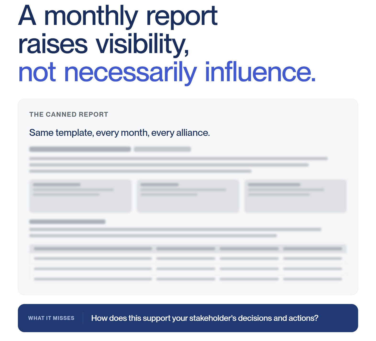
When teams describe their reporting as a way to "show our value", "explain what alliance management does", or "promote the function internally", that is usually a signal that the reports are written from the team's point of view rather than the leader's. Reports built on that foundation tend to grow over time. New activities get added. Nothing gets retired. As the document becomes longer, the signal gets weaker.
There is a better way.
Start from their point of view
The shift that changes everything is small in description but impactful in practice: design the report for the person reading it, not for the team writing it.
Instead of starting from "how do we show our value", a better starting point is a set of questions about the stakeholder:
- What do they care about?
- What information do they need in their role?
- What decisions do they have to make?
- How can we help them succeed?
- How do we fit into their routines?
Those questions move the conversation away from the alliance team's narrative and toward the leader's job. Once the focus is on the reader's job, the relevant metrics tend to surface more clearly.
A simple framework for metrics that get used
What follows is a three-step approach we use with clients. It is deliberately practical. The point is not to produce a perfect set of KPIs on the first attempt. It is to give your team a way to make decisions about what to measure, what to communicate, and what to retire, and to keep doing that as the portfolio evolves.
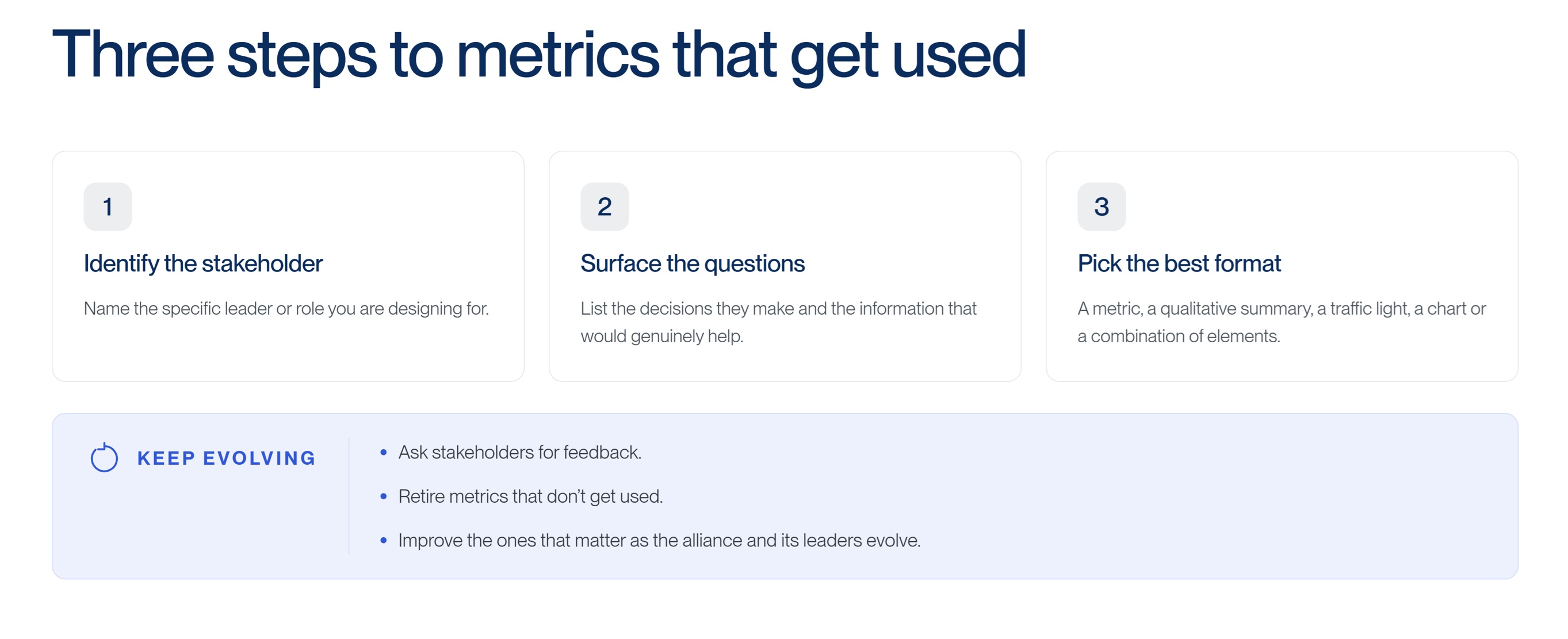
Step 1. Identify the stakeholder
Name the specific leader or role you are designing for. "The executive committee" is a good start, but it is rarely a single audience. An executive sponsor for a particular alliance, the head of a therapeutic area or business unit, a joint steering committee member, a finance partner, and the board each need different things.
For each, capture a few basics:
- Their priorities and who they report to.
- The stakeholders and audiences they serve.
- The questions they need to be able to answer.
- The decisions they need to make that impact alliances.
- What would make their life easier.
This is where we recommend that teams use a simple worksheet, with one column per stakeholder group and rows for these questions. It forces specificity and surfaces overlap. It is also a useful blueprint to share with the stakeholders themselves in a short conversation: "Here is what we think you need. Did we get it right?"
Step 2. Surface the questions and the decisions
For each stakeholder, list the actual questions they need answered and the decisions or actions those answers should support. Then identify the metric, qualitative summary, traffic light, or chart that would influence each decision.
A few things to consider when you do this:
- Is the most useful answer a number, a short narrative summary, or a visualization?
- What format makes the answer easiest to act on?
- What cadence keeps it relevant without becoming noise?
- What can you stop reporting to make room for what matters?
Partnering leaders and Alliance Managers often discover at this step that some of their most labor-intensive content is not connected to any decision. Other items they had not previously reported turn out to be what a particular leader needs. Both findings are useful.
Step 3. Pick the best format
A metric is one option, not the only option. The right format depends on the decision the stakeholder is making and the clarity it brings.
A board member preparing for a quarterly meeting may need a one-line risk indicator and an upcoming decision summary across the portfolio. An executive sponsor for a single alliance may need a slightly richer view, with the alliance health status, a near-term milestone, an upcoming decision, and a payment or financial flag. A joint steering committee member preparing for a meeting may need a full pre-read covering risks, decisions, milestones, the relationship health view, and the alliance's business status.
The instinct to standardize across stakeholders is understandable, but it almost always ends with reports that are too long for some readers and too thin for others. Consistency in data is the goal. Consistency in format is not.
Treat metrics as a living set
The work does not end when the first version of the dashboard ships. The most useful thing alliance teams can do, once a stakeholder is using a report, is ask three questions:
- What are you actually using?
- What are you not using?
- What is missing?
Answers from those conversations should change the report. Items that are not used should be retired. Items that are missing should be added. Items that are used should be made better as the alliance and its leaders evolve. This is a small ritual, but it is the difference between a reporting exercise and a piece of infrastructure your stakeholders rely on.
Where AI changes the picture, and where it does not
The harder truth, for any alliance team that has tried to do this well, is that the more carefully you tailor reports for each stakeholder, the more reports you produce, and the more time your team spends producing them. A small team cannot scale this approach with documents and slides alone.
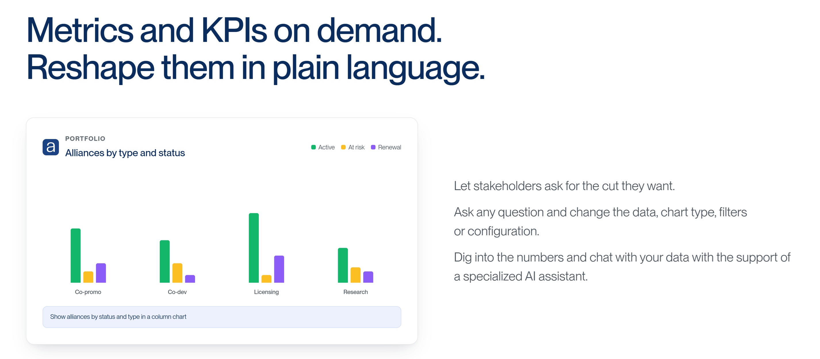
This is where the operating model is starting to change. With portfolio data captured in a single place, alliance teams can move from producing fixed reports on a schedule to letting stakeholders ask questions on demand. A senior leader preparing for a meeting can ask, "What risks should I bring up next week?" and get a short answer with the three or four items that warrant attention across the portfolio. An executive sponsor can ask for an alliance-by-status view and get a chart immediately. The same underlying data feeds both.
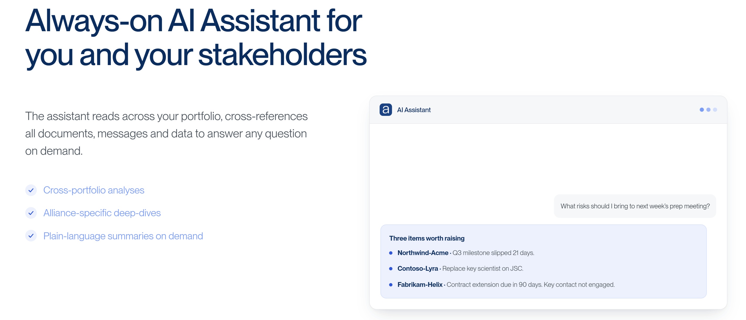
The same applies to the visuals themselves. Stakeholders can ask allianceboard AI to create a chart. They can then reshape it on the spot: change the data cut, switch the chart type, adjust the filters, focus on a single segment by asking in plain language. The output stops being a fixed report and becomes something the reader can shape to their own question in real time. This is what truly drives usage and agility.
What does not change is the work upstream. The data must be there. And it needs to be consistent across the portfolio. The stakeholders' questions must be understood. The relationships still must be built. AI shortens the distance between a good question and a useful answer. It does not replace the thinking about which questions are worth asking.
A practical place to start
If you are looking at your current reporting and suspect some of it is not earning its place, you do not need to redesign everything at once. Pick one stakeholder. Sit down with them for thirty minutes. Walk through the five questions above. Build a small worksheet. Adjust the next report you send them based on what you heard. Then do it again with the next stakeholder.
What you are working toward is not a perfect dashboard. It is a discipline: stakeholder-first design, regular feedback, and a willingness to retire things that are not used. Done well, it raises the influence of the alliance team, and, more importantly, it gives senior leaders the window into the portfolio they have been quietly hoping for.
How allianceboard can help
allianceboard is an AI-powered digital platform used by leading partnering teams to manage their alliance portfolio across the full partnering life cycle from search and evaluation to alliance management. We can help you work through the needs of your stakeholders and understand the data capture strategies that will enable you to raise your team's influence and impact. Get in touch to learn more or to book a demo and see first hand why leading partnering and alliance teams use allianceboard to drive alliance success.